The Alphastrokes Font & Free Tracing Font
| Full Tracing Font |
Free Tracing Font |
|
 |
 |
|
 |
 |
|
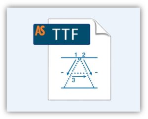
| ✔ Includes horizontal lines ✔ Includes starting positions ✔ Includes stroke arrows |
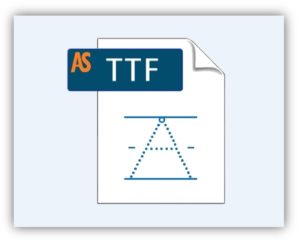
✔ Includes horizontal lines ✔ Includes starting positions ✖ Excludes stroke arrows |
|
| Purchase the full font | Download free tracing font | |
| Read end-user license agreement. | Read end-user license agreement. |
What is the Alphastrokes tracing font?
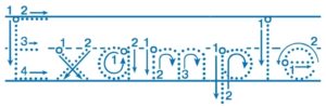
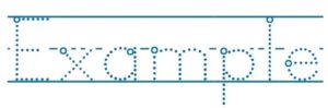
The Alphastrokes tracing font is a TrueType font that assists kindergarten students in printing the letters of the English alphabet correctly and efficiently. It provides lines containing dotted letters for students to trace with the starting position and stroke directions illustrated for each letter, number, and punctuation mark. The Alphastrokes tracing font has been carefully developed to provide an intuitive, practical introduction to writing the English alphabet.

Make your own magnificent worksheets, etc.
- Quickly and easily produce customized worksheets for students
- Easily print off vocabulary words for penmanship and writing practice
- Check out the Alphastrokes flashcards, videos, or workbook to see examples of what you can do with the font.
Why Alphastrokes is the best tracing font on the web
The only tracing font of its kind
As a kindergarten teacher, I am constantly making worksheets for my students who are just beginning to learn to write the letters of the alphabet. At first I scoured the web for a good font that I could use to teach correct penmanship and stroke order, but I could find nothing! So I ended up making my own font. And now it is available for others who are in need of such a font.
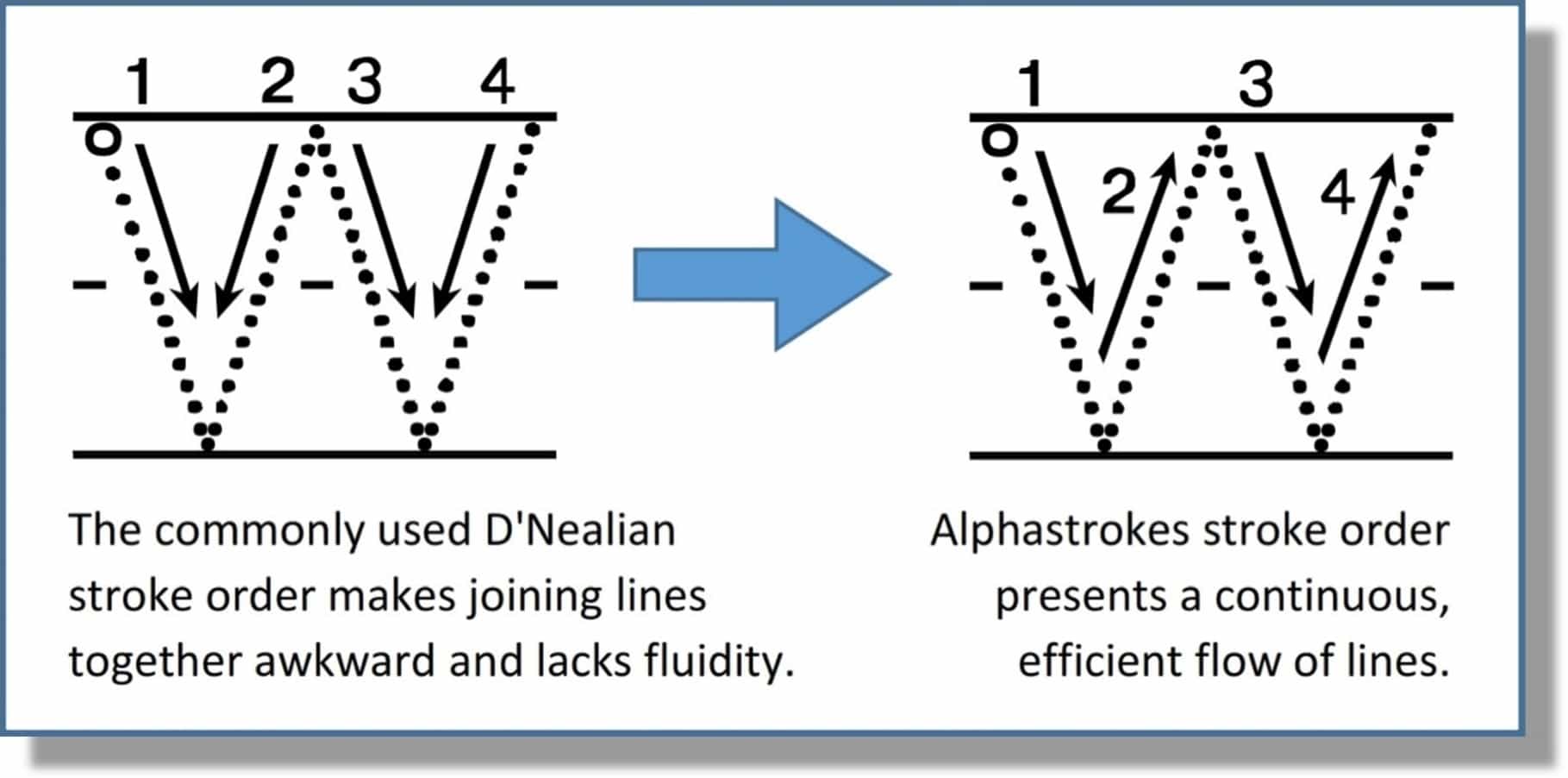
Simple, fluid, logical, practical, standard printing technique
After researching and comparing various English alphabet penmanship techniques, I put together a font with the most logical and efficient stroke orders. Alphastrokes is designed to minimize pencil lifting between strokes and encourage continuous stroke sequences. It deters young learners from developing crude writing habits, such as forming ball-and-stick letters. With this font, stroke sequences flow together smoothly to guide early writers to compose letters correctly and efficiently. Other kindergarten printing styles tend to encourage awkward, unnatural stroke orders and sometimes include unnecessary ornamental strokes. Alphastrokes is simple, fluid, and logical; and it presents a practical universal standard for printing the English alphabet that is easy for young learners to grasp.
Alphastrokes uses logical stroke orders and continuous stroke sequences to…
- Develop letter formation aptitude (encourages phonemic awareness)
- Enhance fine motor skills
- Avert letter reversal problems (confusing b and d, p and q)
- Foster early reading and writing skills
- Prepare students for cursive writing
How It Works
Starting positions
Starting positions are illustrated with a circle where the pencil should be placed when beginning each letter. Starting positions are important for developing correct letter formation skills and efficiency in writing. They also help with letter differentiation. For example, young learners often confuse the letters b and d, but knowing the correct starting positions and stroke orders helps students distinguish between these confusing letters. Furthermore, by learning the starting positions, students become more familiar with patterns in letter formation and letter structure across the alphabet. For example, the round letters a, c, d, g, o, and q all have the same starting position: on the right, just below the midline.
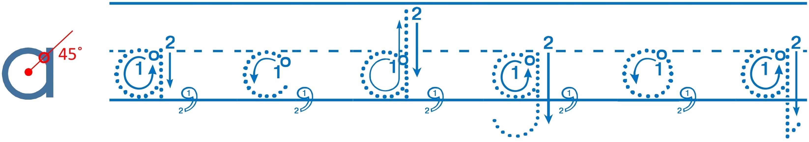
Stroke direction arrows
Stroke direction arrows make it easy for young writers to become familiar with correct stroke orders. The arrows also facilitate in-class penmanship activities. For example, direction arrows can serve as a visual aid for teachers to demonstrate stroke orders. One effective technique is having students put their index fingers in the air and motion the strokes of a given letter. Another excellent technique is for individual students to come forward and motion an index finger over a flashcard or visual projection to practice the correct stroke sequence.
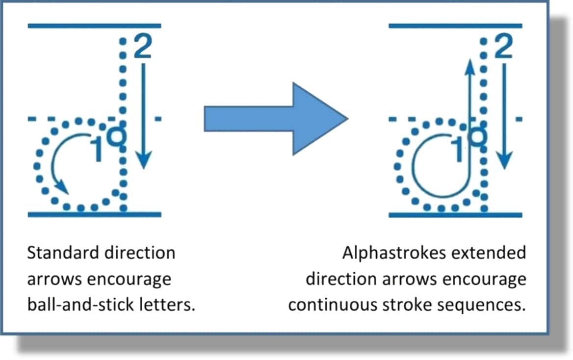
Alphastrokes goes the extra mile
Standard direction arrows encourage correct stroke sequences but often result in unnecessary pencil-lifting. For example, note how the standard direction arrows for the letter d would result in many students inappropriately lifting their pencils between stroke 1 and stroke 2. This lack of continuity results in ball-and-stick-style letter formation, a non-fluid style of printing that is more cumbersome and results in a lower quality of penmanship. The Alphastrokes font uses extended stroke direction arrows to discourage students from unnecessarily lifting their pencils between strokes.
Fluidity
Because Alphastrokes goes the extra mile to discourage unnecessary pencil-lifting, it encourages writing fluidity, which promotes good penmanship and is helpful in preparing students for cursive writing. Most of the lowercase letters should be printed without lifting the pencil from the page between strokes. The only lowercase letters that require lifting the pencil between strokes are f, k, t, x, and y (and, of course, i and j).
| Full Tracing Font |
Free Tracing Font |
|
|
|
|
| ✔ Includes horizontal lines ✔ Includes starting positions ✔ Includes stroke arrows |
✔ Includes horizontal lines ✔ Includes starting positions ✖ Excludes stroke arrows |
|
| Purchase the full font | Download free tracing font | |
| Read end-user license agreement. | Read end-user license agreement. |
Alphastrokes Flashcards Alphastrokes Videos Alphastrokes Workbook Purchase Options